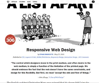
Elements of Responsive Design
Ethan Marcotte, A List Apart — May 2010
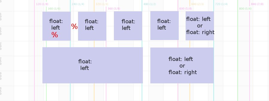
- Fluid grids
- Media queries
- Responsive images
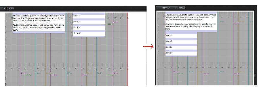
This is only possible if the container max-width is set in ems - no media queries involved
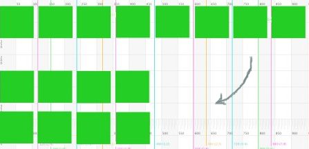
The :nth-child css rule can turn an 8 column row into a 4 column row
.span_1_of_8:nth-child(4n+1) {
clear: both; margin-left: 0;
}